Thursday, April 26, 2012

New Twist on the Family Name

Here's another project I completed in time for my friend's visit. I was inspired by David Bromstad from "Color Splash". He always does a painting for any room he makes over. In this one, he created a painting with the names of all the family members in the style of a eye chart. I thought it was a great twist on how to have a personal, family name painting. It's a bit more subtle, and therefor, I daresay, a little more sophisticated (which is what my loft likes).

I first created the image in photoshop, and agonized over the font choice (as I tend to do). Then, using my projector again (I did this the same weekend as the mural) I traced the text onto a stretched canvas in pencil. I will note, this project is not for the faint of heart, it takes a crazy steady hand and super patience. My skills from typography class finally paid off (we did every project my hand). After I finally finished tracing, I used a variety of brush sizes and shapes to fill in the letters in a very dark grey. My advise, go slow and take breaks. I ended up leaving the background completely white. I may eventually add the hint of a gradient in the corners, as if it were illuminated from behind, but I'm not sure.

Here's the final result.


It sits on the brick in the black nook that used to be an original window because the 3M picture hanging strips won't stick to the concrete we have no intention of trying to drill into. It's next to our vintage 1920's dinning room set.


Ninth Street Notions

Thursday, April 19, 2012

Understated, Modern Family Room Mural

I'm an artist, when I have the time. So even before we moved into our new loft last year, I knew I wanted to paint a mural. In the TV area was a big beautiful (at the time white) wall. It spoke to me. It wanted something inspired by the city, not an ordinary framed picture, but an abstract painting right on it. I decided to do a contour outline of downtown Chicago. The adjacent wall was back at the time, so I first thought continue the black as the line to help tie the two together. Then we decided to paint both walls grey (see the post here). The mural kept getting put off.

About a month out from my best friend's visit for the first time since we moved in, I decided it was time to get lots of projects finished, including the mural. (Nothing like company coming to get you to finally check off your to do list. ;) ) I searched all over the internet for a great reference picture and finally went with a photo my husband took while on a sailboat in Lake Michigan. 

I brought my projector from school home for a long weekend. I set it up on one of our height-adjustable stools and plugged it into the computer. I had to play with the sizing on the screen till I got it just right, and then it was just a matter of tracing on the wall in pencil. Pretty easy, just don't rush. I was going to go with a  white paint for the line, but my husband convinced me to use the gold paint that was left over from our paint sample buying extravaganza. I tested it out just behind the tall shelf on the side. IT WAS HOT! I ended up having to do two very careful coats of the gold to get an even consistency, but it was worth it. We love the result so much that we are going to continue the mural to the wall behind the TV (eventually).


Thursday, April 12, 2012

Eco-Friendly Picture Frame Updates

This past winter I was back in Dallas for my  visit to my Mom's house. She always has projects for me to do around the house. While growing up, I was the one who acted like the handy man in the family (and also the geek squad and interior decorator). I love helping my mom any way that I can.

Anyways, back to this past winter, she was working on creating a family wall (you know the large grouping of family portraits). We went through the large collection of photos, old and new, and started taking pictures out of frames and picking and choosing the keepers. My mom had a large collection of frames in all sizes and finishes, metal, wood, and black. We wanted to create a more cohesive look, so we decided on silver and black. So many of the old frames were natural oak and dated looking, but we hated just wasting them. It finally dawned on me, why buy new ones, just paint the old ones, "duh". 

The summer before, I had spent the better part of my month home spray painting branches and other things for my wedding; so I was a pro. 

We went to HD and bought a can of good quality, glossy finish, black spray paint. 

I removed the glass from the frames.

Sanded the wood.


Placed them on plastic garbage bags in the driveway.

Painted backs first and let dry.

Turned over and painted fronts. (you may need to sand paint drips like in photo) Did a second coat on front as needed.

Wash glass and put back in. Frame pictures.

Easy. Cheap. Less than $5 got us 6 new-looking frames.

I highly suggest the investment (like $2) in a nozzle gun thingy. Saves your fingers alot of pain.

It was dark when I finally got the fronts done so no pictures, sorry. I'm sure you get the idea.

Thursday, April 5, 2012

The Painting Post

Picking out paint colors with my new husband for our new loft, should be fun and easy. Turned out to be the complete opposite. Creating our own style for scratch when we both have strong opinions and our place is a beautiful empty canvas that could go so many ways was frustrating. Also having champagne taste a a beer budget doesn't help. I'll talk about the furniture decisions later. This post is about the system I created for choosing paint samples.

Step 1:
Go to your choice of paint supply store and pick up a ton of sample swatches in the range of colors you are considering and in a good paint brand. When it comes to paint, spending a little more money per gallon will save you time and number of coats, saving you money in the end.

Step 2:
Take your samples home and at different times of day hold them up to the wall, next to any furniture and draperies, next to and wall art, against the floor and in my case even against the ceiling, making notes directly on the sample cards as to what works where. Like I tell my art students, everyone has an eye for what looks good. Pick out your top favorites.

Step 3:
Go back to the store and buy samples in your favorites. In our case that was 6 total for our 4 areas.

Step 4:
Paint sample squares of the paint at different parts of the wall. Since we had so many we made counting marks under the squares and wrote the corresponding number on the sample jar. I just used my artist brushes to paint the squares. Live with the samples for a while and see what works in all different times of day. If you are lucky, you will pick a winner for your wall and move on to step 6.

Step 5 (in my case):
Attend your condo association board meeting where they discuss the new design plans for all the common areas. Turns out their color pallet is way too similar to what we had picked. My husband decided we had to revisit all our color choices. So we repeated steps 1-4 and even made a few last minute choices for samples to buy while we were there ready for them to be whipped up. We ended up getting 7 more samples. I don't suggest ever getting this many samples, it got way too expensive. We also had to switch to roman numerals to keep track.


(The Kitchen stumped us, I just decided to go back to white.)

Step 6:
Go buy your paint and supplies. We went with a paint that has primer in it. It took one good solid coat and one light touch up coat to do the job. The second coat is mostly to go over those few spots that show after the first coat is dry. Word to the wise, the eco friendly roller sponges don't spread paint nicely. When rolling back and forth, they tended to pick the paint back up. Also, buy an angled brush for the edging, it's the only way to go.

Step 7:
Show it off. So happy with the grey, it's what's going in the TV area as well.


-Home Sweet Loft

Thursday, March 29, 2012

Arranging Bookshelves


Our new loft is still on the small side as far as the average American home goes. We also don't want to fill it up so we still have room for whenever a baby does come along. We have a somewhat large book collection even after downsizing as much as we could stand to part with. The question of where to put all these books is something we pondered and discussed since before we moved in. We thought we would need to buy another piece of furniture, further filling up our living space. Then a visit by a new neighbor gave us a different idea: wall shelves in the entry. I had thought I wanted to keep this wall space open and clean feeling, but the more we talked about it, the more it seemed like the way to go. We had saved some simple wall shelves I had in our old place, and we could use them for now till we could afford something more custom in the future. All we had to buy was a few more wall brackets and a stud finder. I started by finding studs, measuring up from the entry ledge and marking where I wanted the top of the bracket. Then I held the bracket in place and marked the holes in the brackets. I failed to remember that the shelf is a bit sorter than the wall. So, instead of it being flush to the brick on the left side, it is centered. Future Advise: Measure Twice, Drill Once. Since I was drilling into studs, I did not need to use screw anchors. If you are hanging shelves, studs are best, but if you can't use them, make sure you have good anchors that will support enough weight.


Drill Tips: Drilling holes for screws: Find the bit that is the size of the solid center of the screw by holding it in front. You should see the thread, but not the center. When in doubt, go for the smaller bit first. You can always make the hole bigger, but never smaller. Drilling holes for screw anchors: Find the bit the same size as the anchor. Drill the hole, then tap in the anchor. If the anchor is very difficult to get in, make the hole slightly bigger, you don't want to damage the anchor trying to get it in. Just like above, it's better to start with a smaller hole and have to make it bigger. *Note: If you use the new anchors that look like giant plastic screws (and hold great), follow similar advise for drilling for screws. Most anchor packages come with instructions as well.
Once I had all the brackets hung, I placed the shelves on top and marked the holes for where the bracket attaches to the shelf and drilled some more. When the shelves were all secure, I started unpacking everything that was going on them and laid it all out.

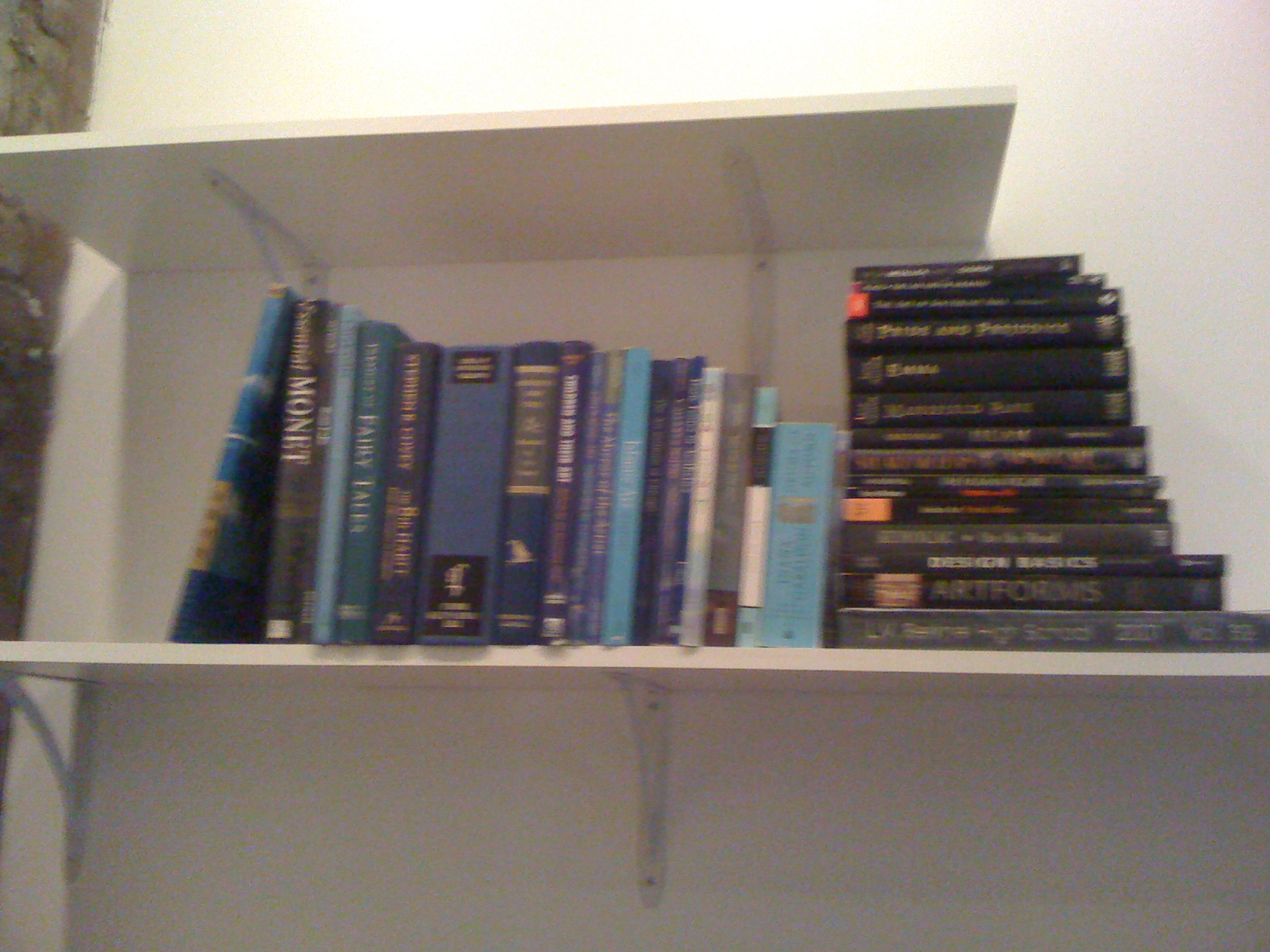
 In the past, I've always arranged my books like a library, grouping by categories. I've seen many design shows and read many articles in which they group books by color. It creates a more streamlined look, instead of the controlled chaos look that I had in the past. I wanted this library to not look so visually cluttered.I started removing dust jackets on almost all the books that had them. Usually underneath is a more solid color, or at least, it's not so shinny. I first pulled all of the black books out and stacked them in order of height. Next, I did the blue book. Blue has by far the largest number of books.  

.


The key to an interesting shelf design is to have some books stacked horizontally, and some lined up vertically. I decided that with so many blue books, they needed to be lined up like in a library. The black books would stay horizontal and act like a bookend.


I finished the rest of my color groupings so I could really see the sizes and amounts I had of each.


There were just so many blue, I decided to break them up by darker and brighter. That way I could space the color around for balance as well.

Deep red/ Dark brown books formed the other "bookend" for the now darker blue line-up.


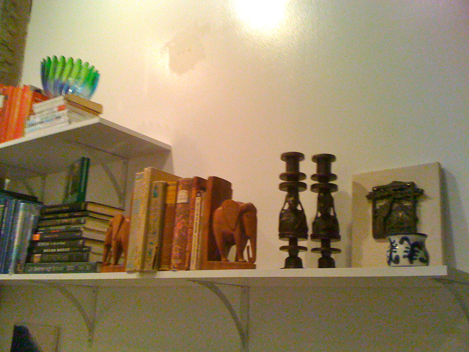
Here we have the final book arrangement. Like the blue, I broke up the tall stack of black books. They are now on the bottom ledge holding up the light blue books. I pulled out my elephant bookends from Tanzania for my light brown books.


Now for the small decor items. Like the books, I pulled them all out to see what I had. These types of things are very difficult to place amongst books. It is best to have odd numbers grouped together of different heights. Also, keep in mind the type of object you are using. I didn't want to place a small round vase on top of both "bookend" stacks of books on either side of the same line-up.

 My advise, take your time, play, and know when to take a step back or even a break. Trust your instincts. I ended up using more than just what you see in this picture.


Here (above and left) is the first arrangement I came up with. It has a good use of high and low, and a good mixture of shapes and textures. But, something felt lacking, especially with the blue and green glass bowl from my grandma at the bottom.


Here is my final arrangement. I moved the glass bowl to the top to make the most of the light hitting it and moved the tall figure over to keep the height on top that I needed.


Instead of spreading out my elephants (one I made in bronze, so it has to have a good spot), I decided to group the figures together for the most visual impact. They are arranged in descending size and angled the same way. My husband's Egyptian box sits on top of the black books.


A few more views of the finished product.


I'm so excited by the results! I even sent pics to some friends and family to show it off. So my conclusion is that if you want that very designed, pulled together look from your bookshelves, then arrange them by color. It's easy and gives you lots of visual impact.

Sorry for the grainy pictures, I'm still working with an old iPhone.

Update: It's been over 6 months since I installed these shelves and they are still going strong. It pays to really take the time to put them up the right way.


-Home Sweet Loft
Related Posts Plugin for WordPress, Blogger...